The Webexpense’s Experience is About to Get Even Better!
A fresh new look, a smoother user experience and a whole raft of new features and functionality - this is what you can expect from the all new-look webexpenses!
It’s the result of months of development work guided by the valuable feedback we receive from our users on ways to improve the look and feel of webexpenses.
Whilst the core functionality of our expenses management software remains the same, we have added an array of new features and functionality.
The fresh new look provides a coherent, cross-platform experience - with the focus throughout on making the management of expenses simpler and more effective than ever before!
The improvements go beyond the cosmetic with a range of new features also being added to the interface.
The new features include:
- Drag-and-drop functionality
- Duplicate claim warnings
- End-to-end mobile submission
- Cloud-based receipt repository
- Email receipts functionality
- Improved reporting with built-in analytics
This means that your expenses can now be processed even faster, and more securely - whilst expenses data can be monitored even more effectively with our new reporting tools.
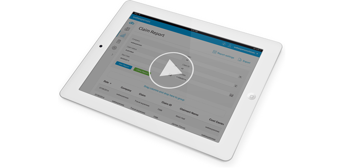
Don't just take our word for it, take a look in our new video.
Michael Richards, webexpenses' chairman said:
“Our aim is to transform expense management from something people dread into something so seamless and simple that it can actually be enjoyed.
“We believe this update is a major step towards achieving this and it’s thanks in a large part to the quality feedback we receive from our clients.
“The look of our software is important but we didn’t want to make changes unless they were firmly tied to those day-to-day practicalities that our users care about.”
To celebrate our new launch, we’re offering the chance for 1 new client to win free webexpenses software for 12 months* with our 'expense for free' campaign!
Make sure you receive all the latest details about our promotion by joining us on Twitter at: #expenseforfree


